English
 Español
 عربى


Choosing a decorative film by its name alone is where most color matching problems begin. A product labeled walnut may look brown in the catalog, but once applied to a cabinet door it can pull red, yellow, or even green depending on the base material, the lighting, and the finishes around it. The reliable approach is to match the film to the room's dominant surfaces first, then to its function, and only then to personal taste.
This guide explains the practical rules that make decorative film color matching predictable on real furniture, walls, and panels. It is written for furniture manufacturers, interior contractors, and renovation buyers who need a repeatable method instead of guesswork.
Start with the Room's Dominant Tone, Not the Film
The largest surface in the room usually sets the color temperature. Wood flooring, wall paint, floor tiles, and existing cabinet bodies all carry a tonal direction: warm, cool, or neutral. If those surfaces are warm, a warm wood grain or cream marble film will blend in. If they are cool, a gray or white marble pattern will look intentional. The conclusion is simple: choose a film that sits one step lighter or darker than the dominant tone, or choose one neutral enough not to argue with it.
On a practical level, put the sample against the actual substrate. A film that looks faded on a white cardboard swatch often appears richer on a dark MDF panel, and a bright white marble film can turn slightly yellow on a cream cabinet. Compare the film side by side with the floor sample and the wall color card before ordering full rolls.
Three Rules That Make Decorative Film Color Matching Predictable
Rule 1: Match the undertone before the color name
Two films can both be named walnut and still look different, because the undertone, the warm, cool, or neutral cast inside the color, is what the eye reads first. Warm undertones lean toward yellow, orange, or red. Cool undertones lean toward blue, green, or gray. When the floor is warm oak, a walnut film with a yellow undertone will harmonize, while a walnut film with a gray undertone will look dull by comparison.
Rule 2: Light decides how the color is read
A film sample evaluated under a single shop light can mislead you. North-facing rooms and LED lighting at 4000K make cool colors look clearer and warm colors look flatter. South-facing rooms and 3000K lighting warm up the same film. Evaluate samples under the actual lighting of the room, and check them again in the evening before making a decision.
Rule 3: Use proportion, not the whole room
In interior composition, a practical split is 60-30-10: 60 percent dominant tone from floors and large walls, 30 percent secondary tone from cabinets and panels, and 10 percent accents. Decorative film usually belongs to the 30 percent layer. It should harmonize with the 60 percent base rather than compete with it.
Warm undertone
Oak, walnut, rosewood, golden marble. Best for living rooms, studies, and bedrooms with warm flooring.
Cool undertone
Calacatta, gray marble, slate, silver textures. Best for kitchens, bathrooms, and office walls.
Neutral undertone
Ivory, beige, light gray solids. Best for ceilings, large walls, and rental refresh projects.
| Film category | Undertone | Best spaces | Lighting suggestion |
|---|---|---|---|
| Oak, walnut, rosewood wood grain | Warm | Living room, study, bedroom wardrobes | 3000K warm LED |
| Calacatta, gray marble, slate | Cool | Kitchen splashback, bathroom, office | 4000K neutral LED |
| Ivory, beige, light gray solids | Neutral | Ceiling, large walls, rental refresh | Daylight or mixed |
Match the Film Finish to the Surface Function
A film's finish changes how its color is perceived. High-gloss surfaces reflect more light and look lighter and more saturated. Matte surfaces absorb light and look deeper and more muted. The same golden oak pattern reads differently in gloss than in matte, so the finish should follow the function: glossy for splashbacks and feature walls, matte for large bedroom panels and ceiling surfaces.
Heat transfer and cold peel change the selection
The application method also matters. Hot stamping film transfers the decorative layer with heat and pressure, which suits flat cabinet doors and panels where the adhesive bonds firmly. Cold peel film is applied without heat, making it easier to reposition on vertical walls or curved surfaces. If you are decorating plastic substrates with hot stamping foil, read how to match hot stamping foil to plastic substrates first, because the substrate's heat tolerance and surface energy affect both adhesion and final color.
Texture changes the color logic
3D transfer film adds a structured surface that changes how light hits the color. A marble pattern with a slight embossed vein looks closer to real stone than a flat print, but the recessed areas read darker. On large walls, this depth can actually make color matching easier, because it breaks a single color block into smaller light and shadow zones.
Room-by-Room Decorative Film Color Matching Guide
Living room and TV background wall
Use a wood grain film for the TV cabinet and let the feature wall carry a contrasting pattern. Warm oak brings the cabinet visually closer to the floor, while a dark marble or gilded pattern anchors the television area. If the floor is gray, choose a cooler oak or a solid gray film instead.
 Golden Oak Textured PET Heat Transfer Film for TV CabinetsThis wood-grain PET film suits TV cabinets and feature walls with warm oak tones, offering moisture resistance and easy maintenance while complementing gray floors. Its layered texture creates a natural, lasting finish for modern living spaces.View Product →
Kitchen and bathroom
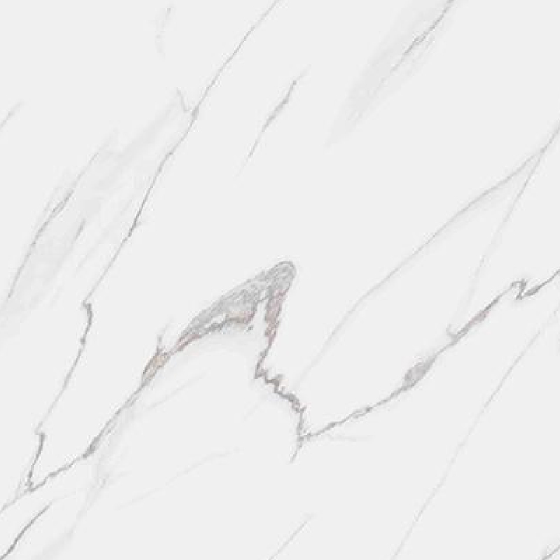
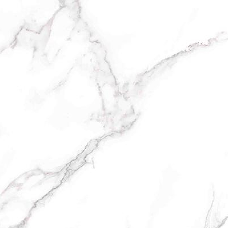
Moisture and oil resistance are not optional in these rooms. Marble patterns in white, gray, or black are the safest color choices because the veining hides stains and the palette matches stainless steel, ceramic tiles, and most countertop materials. This is also the reason many specifiers now rely on marble grain heat transfer films for wet areas.
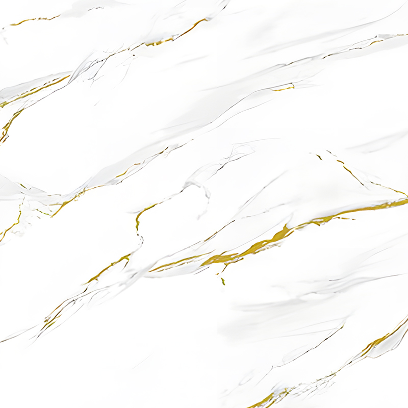
 Waterproof UV-Resistant Lauren Gold Heat Transfer FilmWith a metallic Laurentian gold finish, this durable film resists moisture and scratches while maintaining color stability. It works well for wet areas or cabinet refacing, providing a luxurious yet practical surface solution for high-end furniture.View Product →
Furniture and wardrobe refresh
When the goal is to change the color of existing cabinets without replacing them, choose a film with strong adhesion and some surface structure. 3D transfer film works well on wardrobe doors, office desks, and kitchen cabinet fronts, and its texture makes the new color look like a factory finish rather than a sticker.
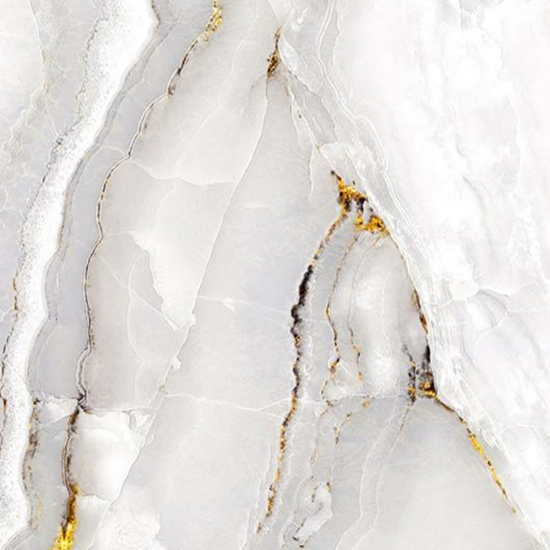 3D Heat Transfer Film for Furniture and Cabinet RefacingApply this film directly to existing cabinet doors to transform their color and texture with realistic wood, stone, or geometric patterns. It offers strong adhesion and a factory-like finish, reducing renovation effort and cost while updating kitchen or bathroom spaces.View Product →
For any room, give the color at least two days before deciding. Apply the film to one small door or panel, place it in the room, and observe it in daylight, in evening lighting, and next to the floor. A color that feels wrong on day one often settles once the surrounding surfaces are in view.
Common Decorative Film Color Matching Mistakes
- Choosing color from a phone screen photo. Screens compress the tonal range and shift the hue, especially for wood grains and beige solids.
- Comparing the film against white cardboard instead of the actual substrate. The base color and surface absorption change how the film appears.
- Forgetting the base material. Dark MDF makes translucent films look darker; light PVC boards make the same film look brighter.
- Matching only the countertop and ignoring the floor. The floor is usually the largest surface in the room and dominates the result.
- Using high-gloss film on large uneven walls, where every surface wave becomes visible and turns the color into a distraction.
- Changing the lighting color temperature after installation. Swapping
3000Kbulbs for4000Kbulbs can shift the whole room's color balance.
Frequently Asked Questions
Q1: Can I match a decorative film to an existing cabinet color?
Yes, but match by undertone rather than by the exact color. Place a sample directly on the cabinet door, wait a day, and check it under both daylight and evening lighting.
Q2: What is the difference between matching by undertone and matching by color name?
Color names change between brands and series. Undertone is the hidden warm or cool cast inside the color. Two films named walnut can have completely different undertones, so the undertone is the reliable variable.
Q3: Does gloss level change how the color is perceived?
Yes. Glossy films reflect more light and look lighter and more saturated. Matte films absorb light and read deeper and softer. Choose the finish according to the surface function: glossy for splashbacks and feature walls, matte for large panels and bedrooms.
Q4: How should I test a film color before committing to a full roll?
Order a small sample or a one-meter cut, apply it to the actual surface, and evaluate under the same lighting the room will use. Check it in daytime, at night, and against the floor and wall samples.
Decorative film color matching is a sequence of small decisions: undertone, lighting, finish, and proportion. When each decision is tested against the largest surfaces in the room, the result looks intentional rather than accidental, which is what turns a surface renovation into a professionally designed interior.